
15 Principles for Human Centered Design
Today marked the last day of the Human Computer Interaction course I took this summer through my GT master’s program. Here’s a look at some user interface design principles that we touched on during lecture.
Design Principles
There are 15 different principles that HCI researchers use to evaluate an interface. These principles were developed by Don Norman, Jakob Nielsen, Larry Constantine and Lucy Lockwood.
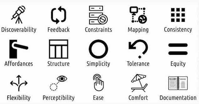
Discoverability — Relevant interface functions should be made visible, instead of requiring a user to read about them in documentation. There is a natural tension between discoverability and simplicity.
Simplicity - The interface is easy to understand and use, irrespective of a user’s experience, knowledge, or level of concentration. The interface is not cluttered with unnecessary information that distracts from accomplishing the primary task.
Affordances - Interfaces that “hint at” the way they are meant to be used. The interface’s perceived affordance might be at odds with its actual affordance (e.g. a door with a handle seems like it should be pulled, but the door actually needs to be pushed). You can add signifiers to the interface to help a perceived affordance match the actual affordance (e.g. a label next to the door handle that says “push”).
Mapping - Used in HCI to describe the relationship between the interface and real world equivalents. Interfaces should speak the language of the users who use it, favoring language in their terms vs system-oriented language. e.g. we use cut, copy, paste instead of duplicate, since this maps better to terms and actions that users already know.
Perceptibility - The user’s ability to perceive the state of the system. Are they closer or farther away from accomplishing their goals? This is very important with digital systems, so users do not feel helpless when attempting to accomplish their tasks.
Consistency - Design interfaces using familiar components which behave the same, so users do not need to re-learn your interface from scratch. Consistency is generally the best option, unless a design alternative provides a 10x improvement in usability.
Flexibility - An interface should accommodate a wide range of users with varying levels of expertise. Allow users to use your interface in ways that fit with their standard workflows: e.g. some users are more comfortable copying and pasting using the right-click menu commands instead of keyboard shortcuts. Both accomplish the same task, but fit in to different user workflows.
Equity - An interface is useable by users with diverse ranges of ability (accessibility).
Ease - The design can be used with minimal amounts of fatigue.
Comfort - Users of varying physical sizes, postures, mobility, can use the interface without strain.
Structure - A user interface should be architected in a way that is organized and makes sense to the end user. e.g. information layout on a page is often made consistent with standards adopted from the newspaper industry.
Constraints - Preventing a user from performing erroneously in the first place by constraining their possible behaviors. Password reset flows with client-side validations are a good example of this: they prevent the submit button from being made available until the user has successfully met password requirements.
Tolerance - The user interface should be designed such that errors that inevitably occur do not cause too much setback for the user in accomplishing their primary task. Supporting standard functions like undo and redo give users a sense of security when using an interface, and make them more likely to engage and explore.
Feedback - Users should receive clear and direct feedback in response to errors generated by operating the interface. Oftentimes, vague or confusing feedback is worse than no feedback at all, since it can be distracting, misleading, and anxiety provoking for users.
Documentation - Some documentation is likely inevitable. This documentation should be built around use cases for tasks that the user wants to accomplish with your system, instead of describing every possible system function out of context.
That’s a lot of principles!
There sure are! But there are small and important lessons to be learned from each of them.
Some of the most important takeaways for me are:
1) Consistency trumps originality - users prefer systems that feel similar to what they already know
2) Perceptibility of system state is an often discounted but very important aspect of system design
3) Constrain the user from taking bad actions in the first place
4) Simplicity is often at odds with discoverability: a crowded interface is no good, but key actions and information should not be buried.
Comments